
Translating Identity into Interior Design
Brand color psychology plays a defining role in how people experience a company, often before a conversation ever begins. In commercial interiors, color doesn’t just decorate space; it communicates trust, energy, authority, creativity, or calm.
When done well, color reinforces brand identity in a way that feels intuitive and human. When done poorly, it creates visual noise and brand confusion.

01 From Logos to Lived Environments
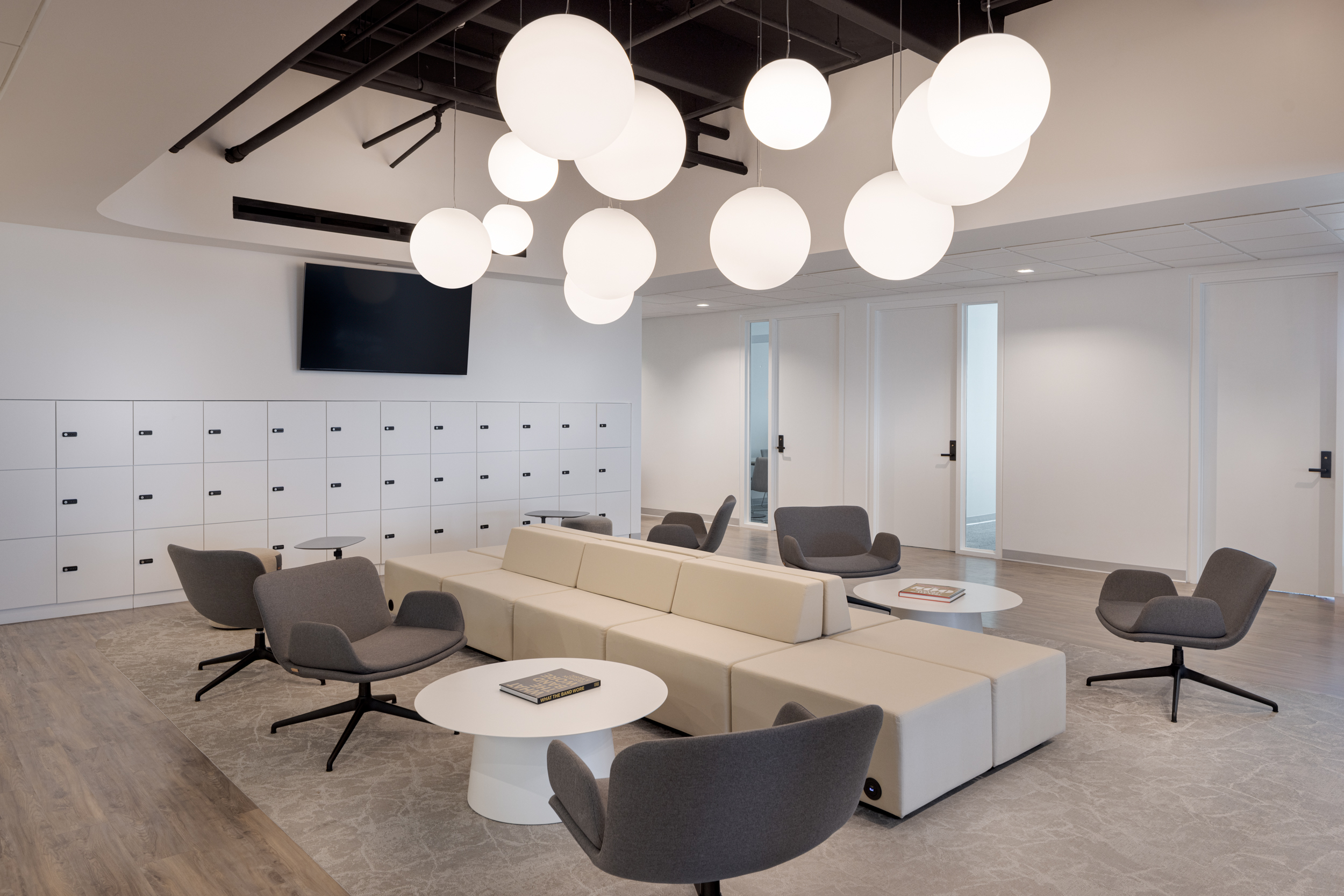
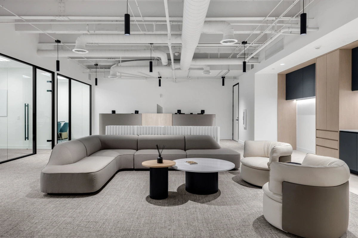
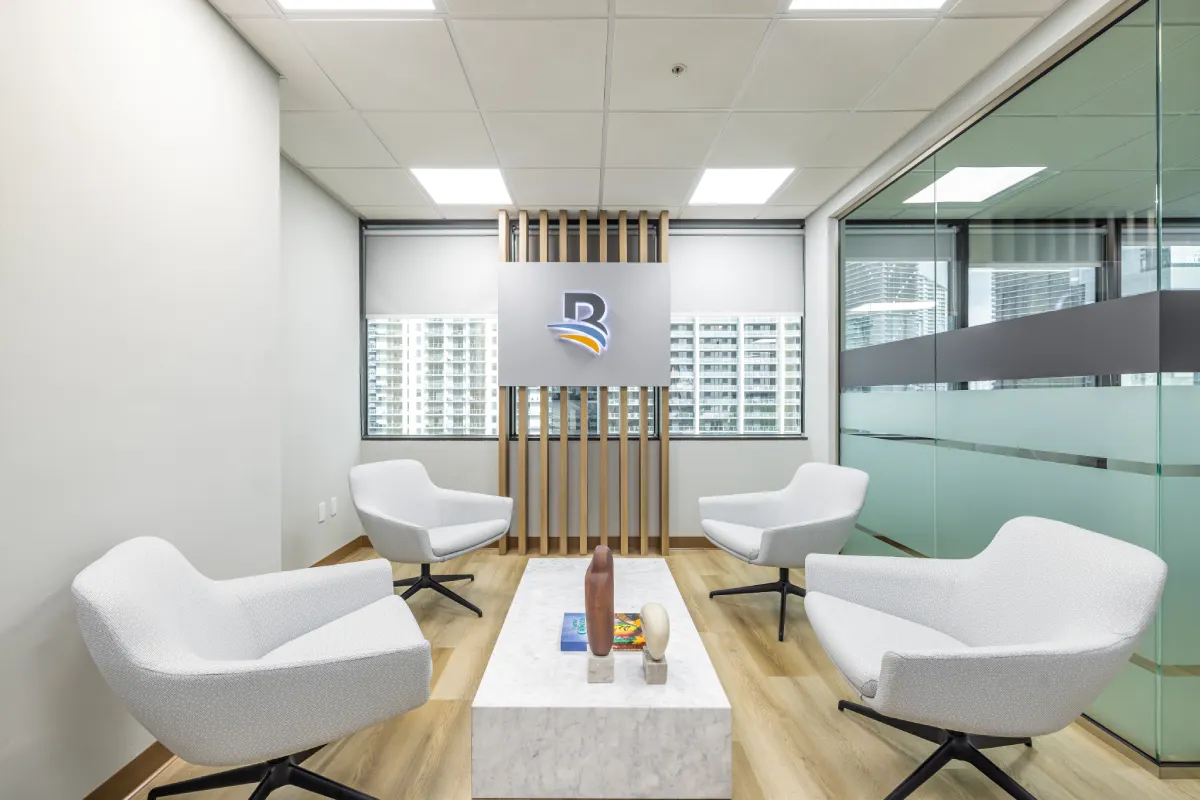
Earlier generations of branded interiors relied heavily on logo walls and bold paint applications. Today, brand color psychology is more nuanced. Designers create environments that feel like the brand rather than announce it .
A technology brand might avoid loud primaries in favor of cool neutrals accented with controlled hits of brand color. Why now? Employees and clients value authenticity over performance branding.
02 Emotional Alignment Over Visual Consistency
Consistency used to mean repetition. Now it means emotional alignment. A brand known for innovation may use energizing hues in collaborative areas while maintaining neutral palettes in focus zones.
03 Materials as Brand Messengers
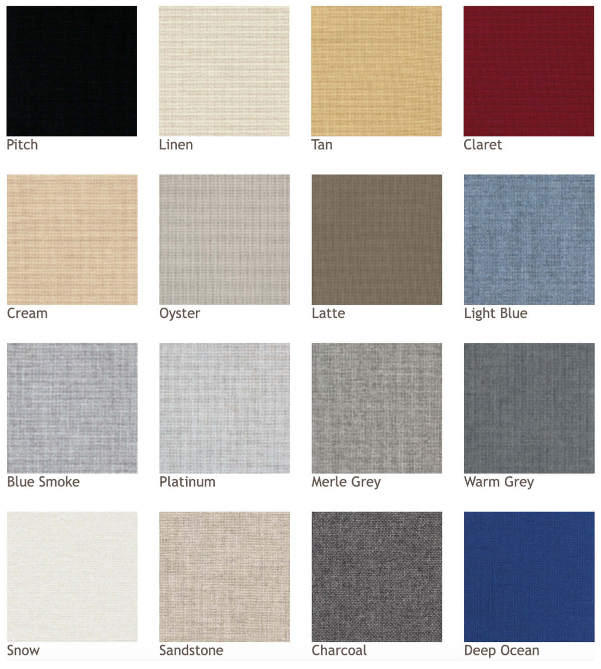
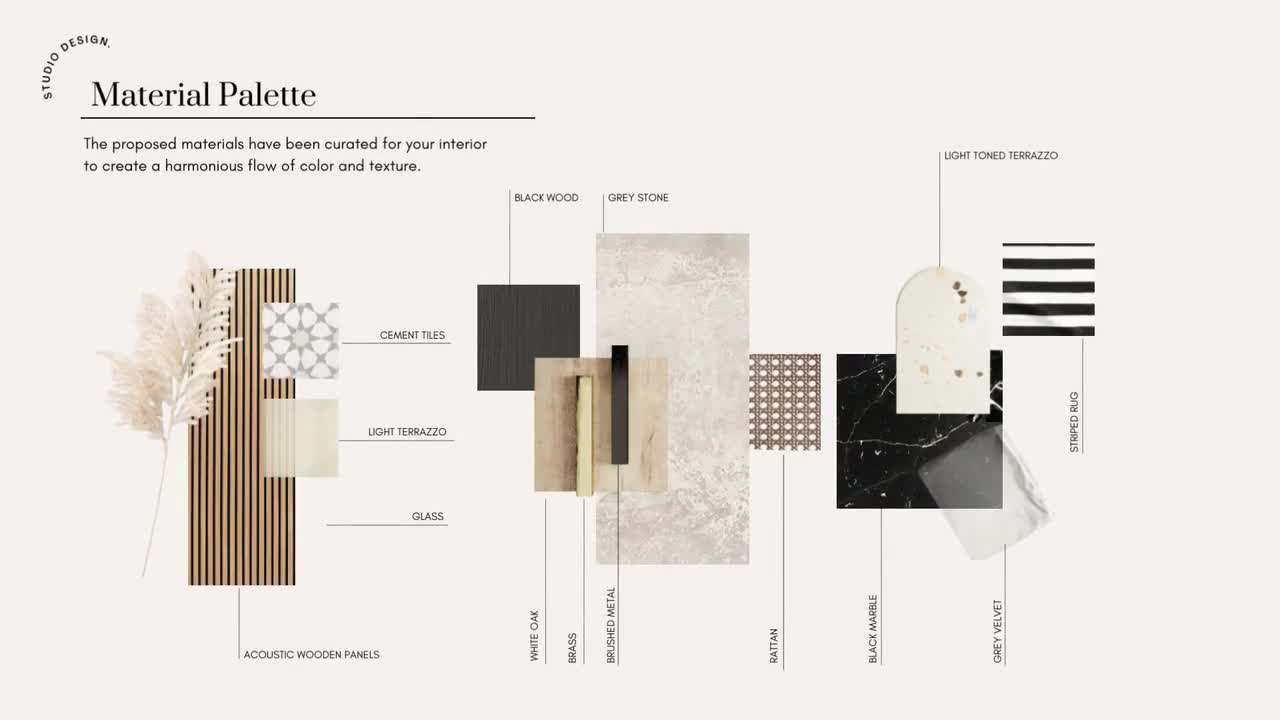
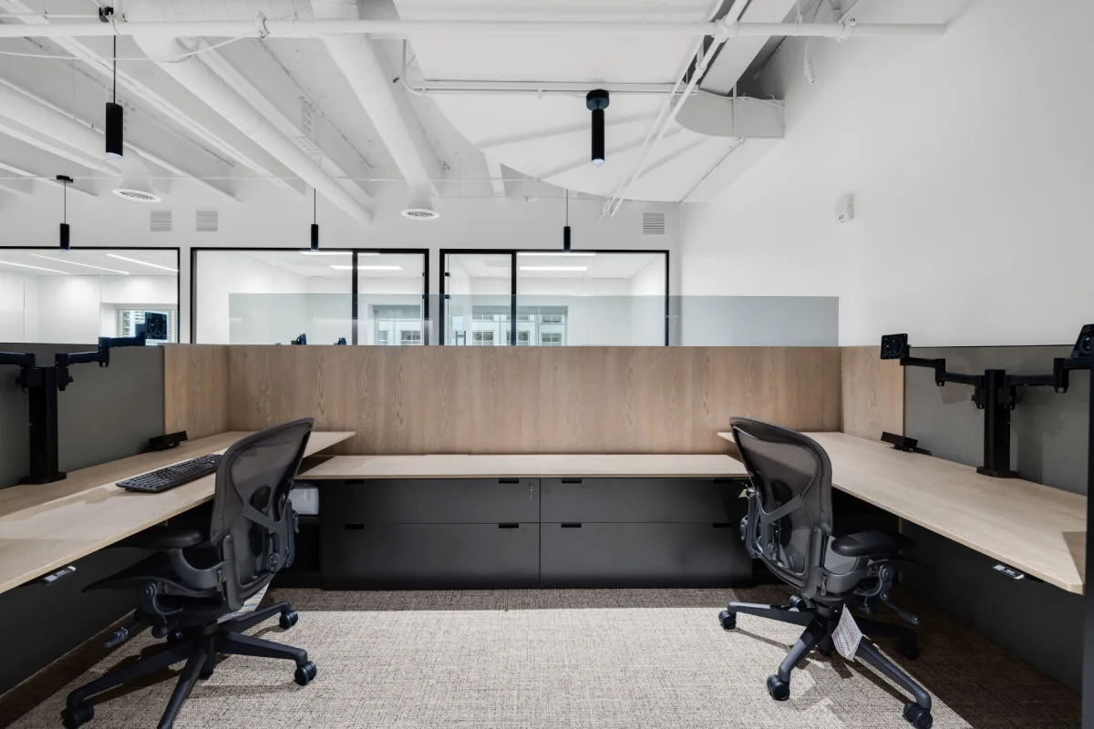
Paint alone no longer carries the burden of brand expression. Materials, textiles, laminates, woods, and metals now deliver color in tactile, durable ways .
Upholstery allows color to appear where people physically interact with the brand. This shift reduces visual fatigue and improves longevity, a brand color expressed through fabric ages far better than large painted surfaces.
04 Regional and Cultural Sensitivity
Global brands are aware that color associations vary by geography. A bold red may read as energetic in one market and aggressive in another. Design teams are responding by developing adaptable brand palettes that maintain identity while respecting local context.
How to Act on It Next Quarter
- ✔ Audit existing interiors against brand values, not just colors.
- ✔ Define primary, secondary, and accent color rules for space.
- ✔ Align color intensity with function and dwell time.
- ✔ Test palettes through materials, not just renderings.
Color is the missing link.
If your spaces don’t reflect who you are as a brand, a strategic color audit can realign identity, experience, and perception before costly missteps occur.


.webp)
.webp)