Office Color Psychology
Designing for Focus and Well-Being
Office color psychology works best when you use color to support behavior by zone. The goal isn’t to “pick pretty colors,” it’s to shape attention, stress, and energy in ways that feel natural for real work. Learn how to translate brand identity into interior design through color here
The Golden Rule: Use color intentionally by space type (Focus, Collaborate, Recharge) instead of one palette everywhere.
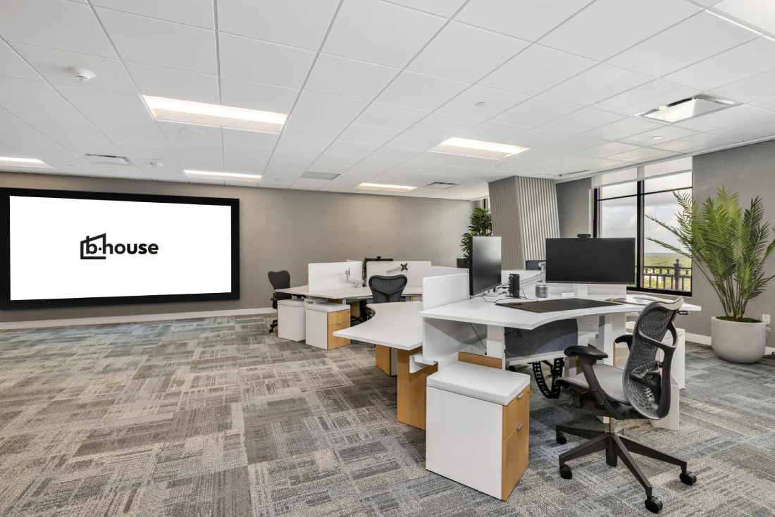
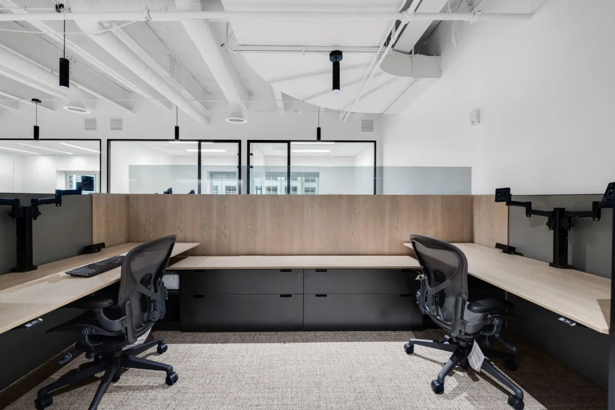
01 Neutral Foundation + Muted Focus
Start with a neutral foundation to reduce visual fatigue. For heads-down focus zones, use cooler, muted tones (in finishes or screens) as they feel less "loud" and support concentration.
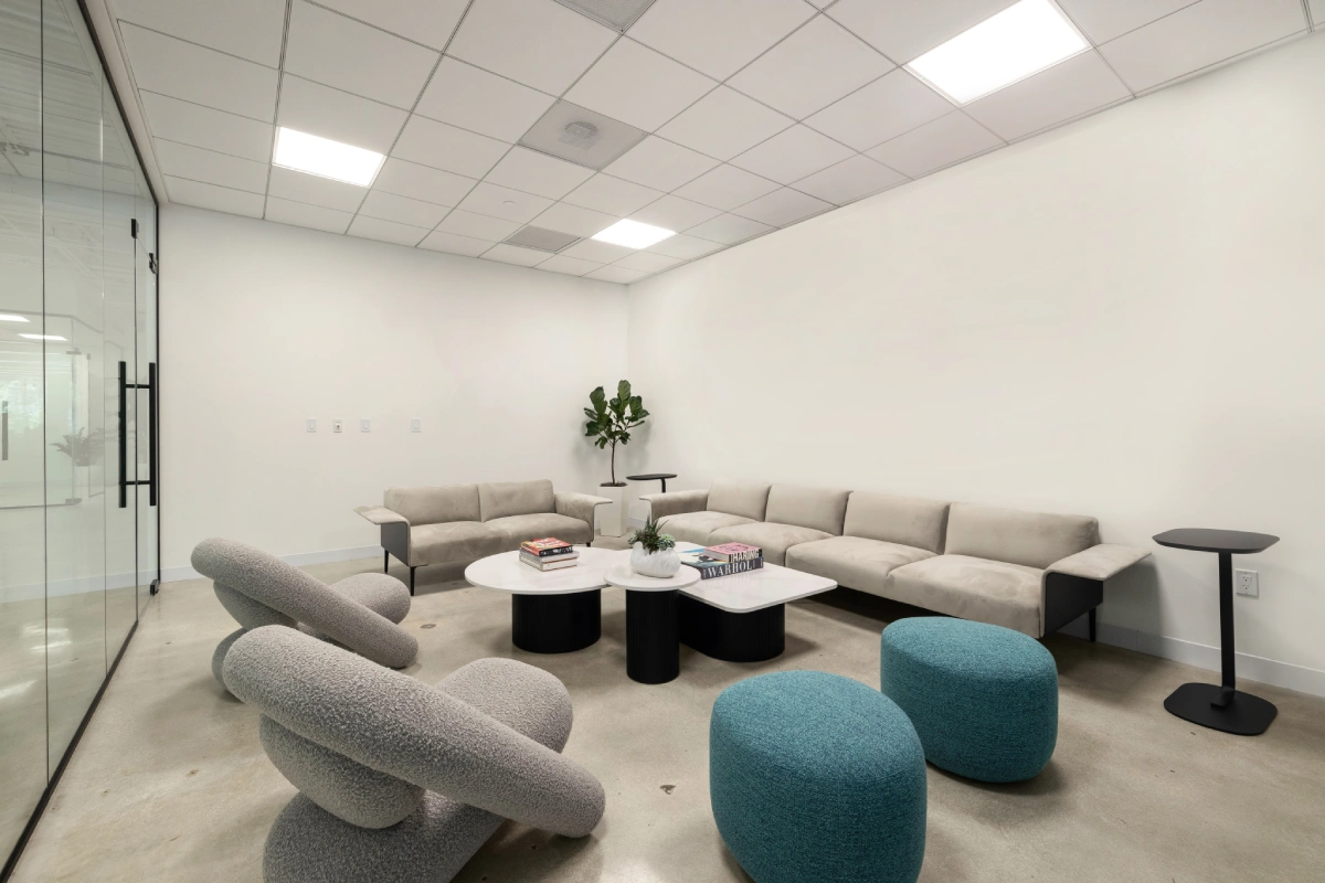
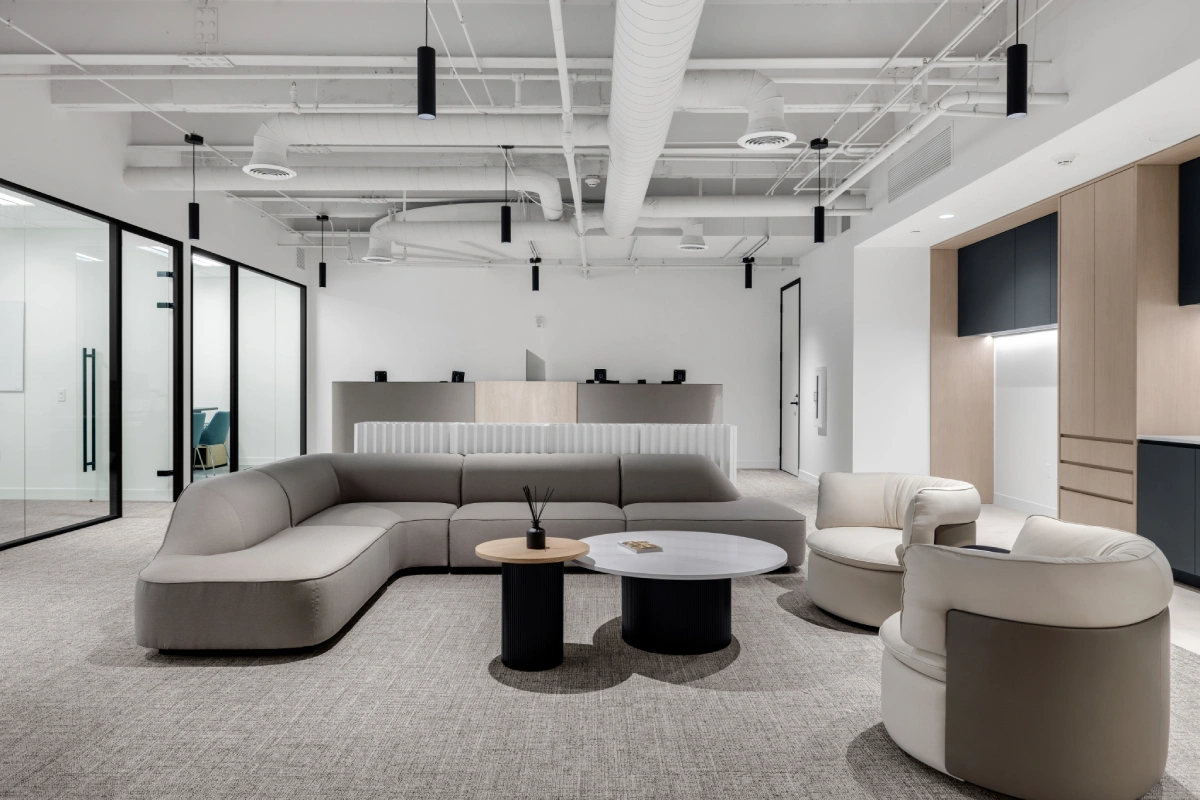
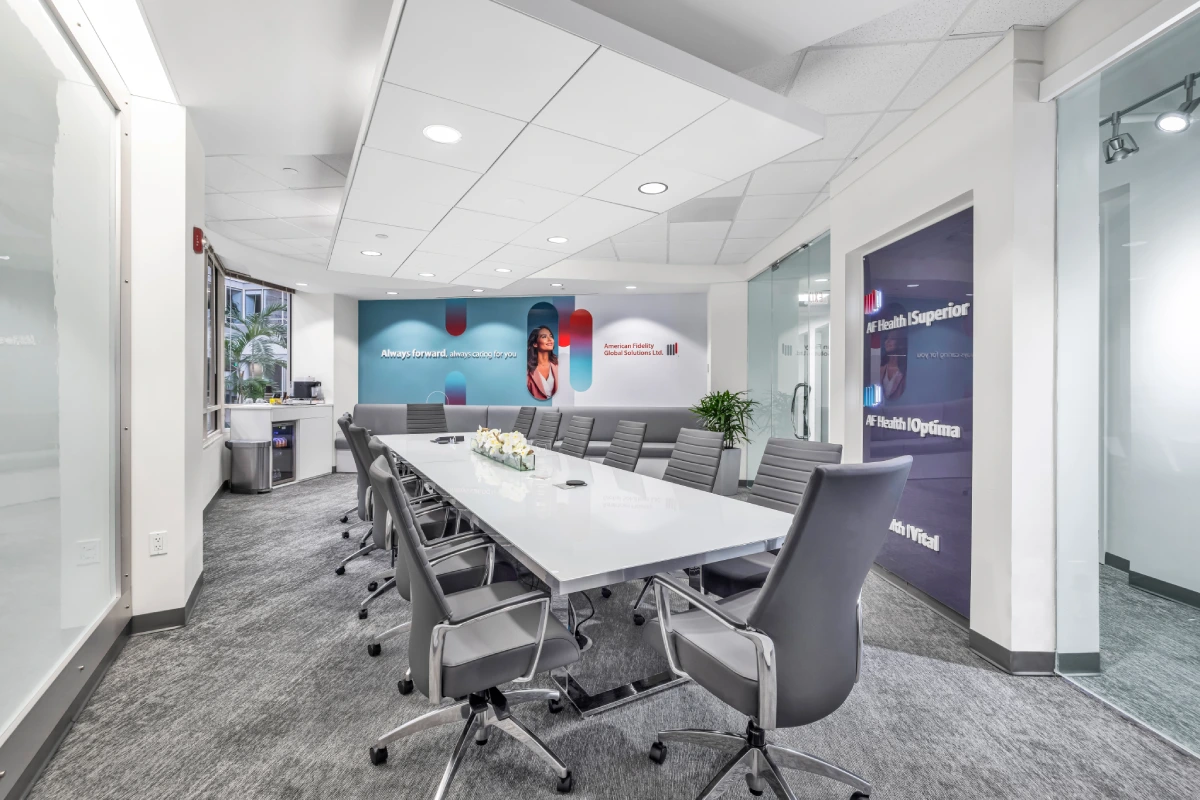
02 Warm Accents for Energy
Collaboration zones need energy. Warm accents make spaces feel inviting and socially safe to speak up. Use these in upholstery, art, or rugs rather than committing to bold wall paint everywhere. Discover how to Translate Brand Identity into Office Design
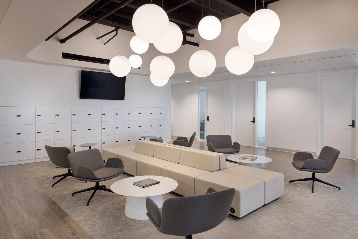
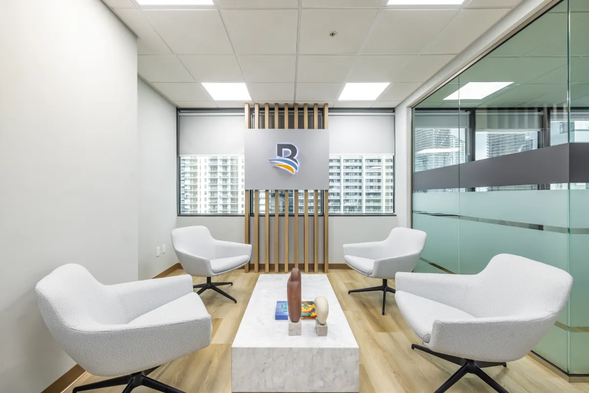
03 The Recharge Palette
Wellness cues reduce stress. In break areas, use soft nature tones and greens (plants count as color!) to create a psychological "downshift" signal.
10-Second Recap
- ✔ Neutrals for the majority (walls/large surfaces).
- ✔ Cool/Muted for focus zones.
- ✔ Warm Accents for collaboration.
- ✔ Nature Tones for recharge areas.
- ✔ Test Everything in real lighting conditions.
Want a palette that works?
We can help you build a zone-based palette + furniture finish schedule that supports well-being without the risk of bold repaint regrets. Design your palette.


.webp)
.webp)