Brand color psychology is the strategic use of color to express a company’s identity within a physical environment. When applied thoughtfully, brand color psychology in interior design strengthens recognition, reinforces culture, improves employee experience, and elevates client perception, all without overwhelming the space.
For design leaders, the challenge isn’t whether to use brand colors. It’s how to translate them into environments that feel elevated, human-centered, and timeless.
Below are nine practical, design-forward ways to do exactly that.
1. Begin With Brand Meaning : Not the Swatch Book
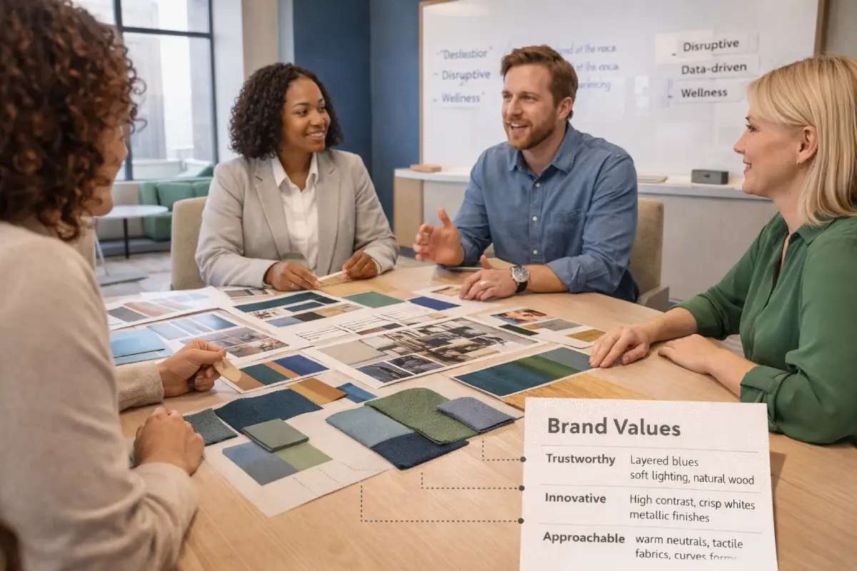
Before specifying paint, revisit what the brand stands for.
Is it innovative and disruptive? Warm and hospitality-driven? Precise and data-focused? Calm and wellness-oriented?
Why it matters for Design teams: Color decisions disconnected from brand values create visual noise. When leadership walks through the space, they should feel alignment, not decoration.
Starter step:
Run a short brand-to-space workshop mapping three brand adjectives to environmental expressions:
- “Trustworthy” → layered blues, soft lighting, natural wood
- “Innovative” → high-contrast accents, crisp whites, metallic finishes
- “Approachable” → warm neutrals, tactile fabrics, curved forms
This ensures brand color psychology drives intention, not impulse. Learn How to Use Brand Colors for Zoning, Wayfinding, and Spatial Clarity here
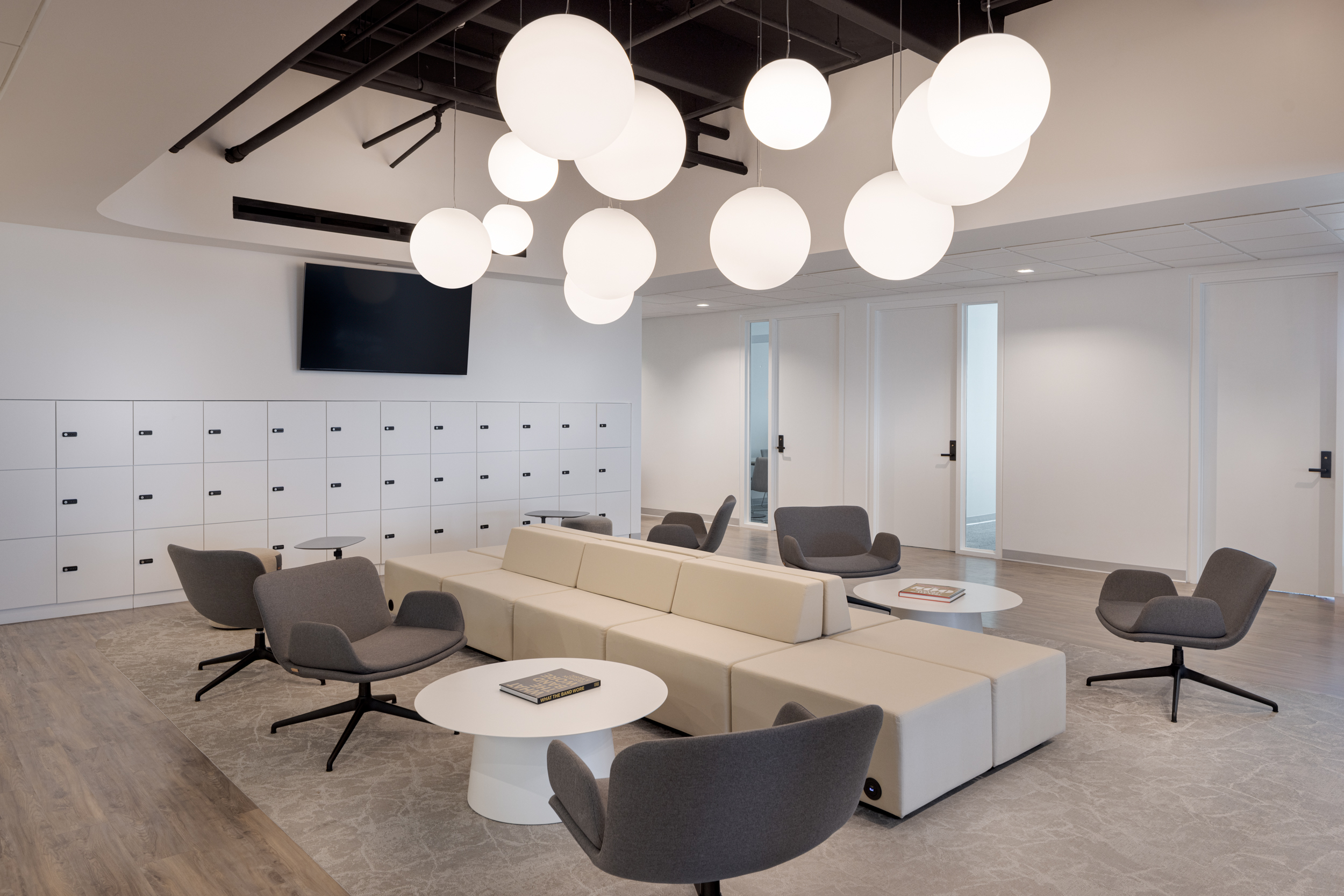
2. Distinguish Between Primary, Secondary, and Environmental Color
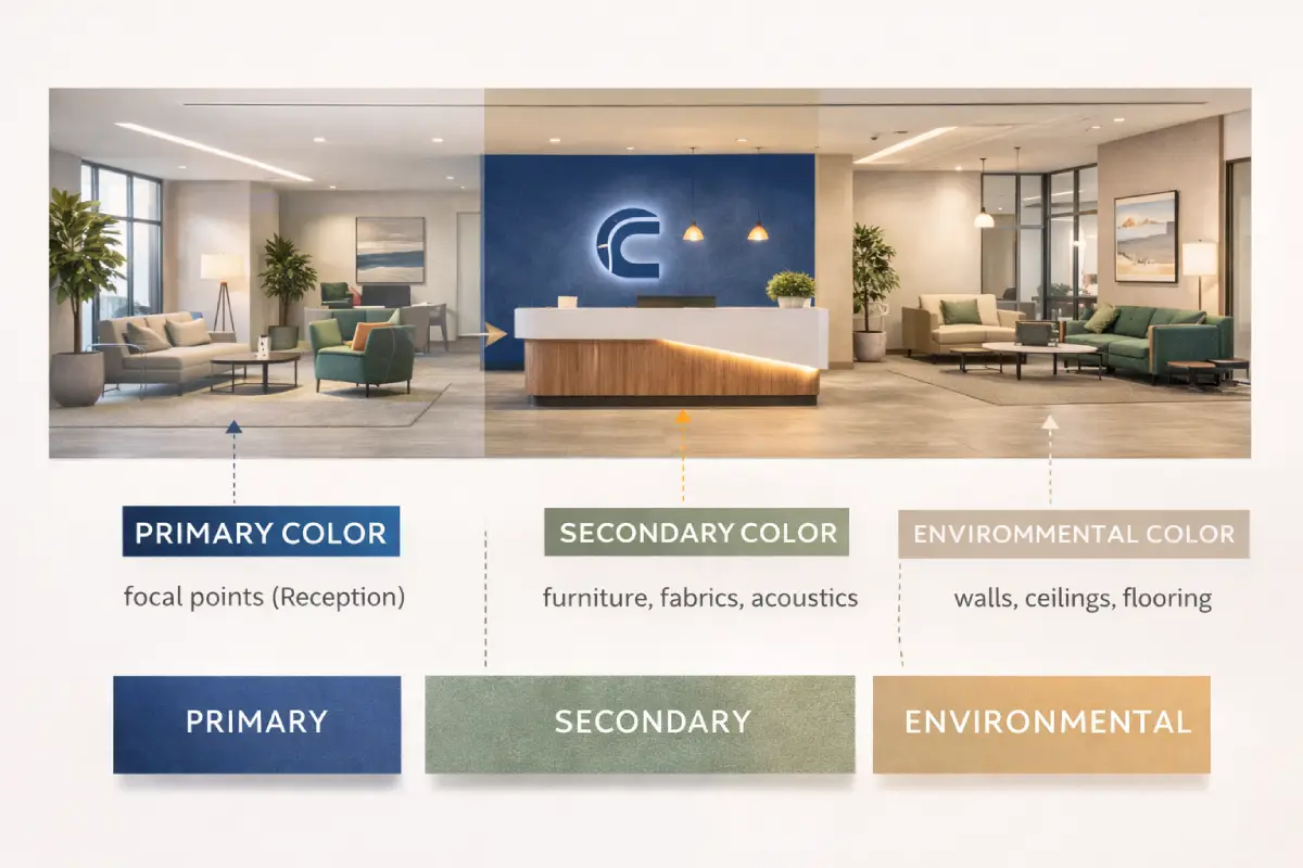
A logo’s primary color is rarely suitable for 10,000 square feet of drywall.
Why it matters: Oversaturation increases visual fatigue and can negatively impact focus and lighting performance.
Best practice framework:
- Primary color → focal points (reception desk, collaboration hub backdrop)
- Secondary colors → upholstery, acoustic panels, wayfinding markers
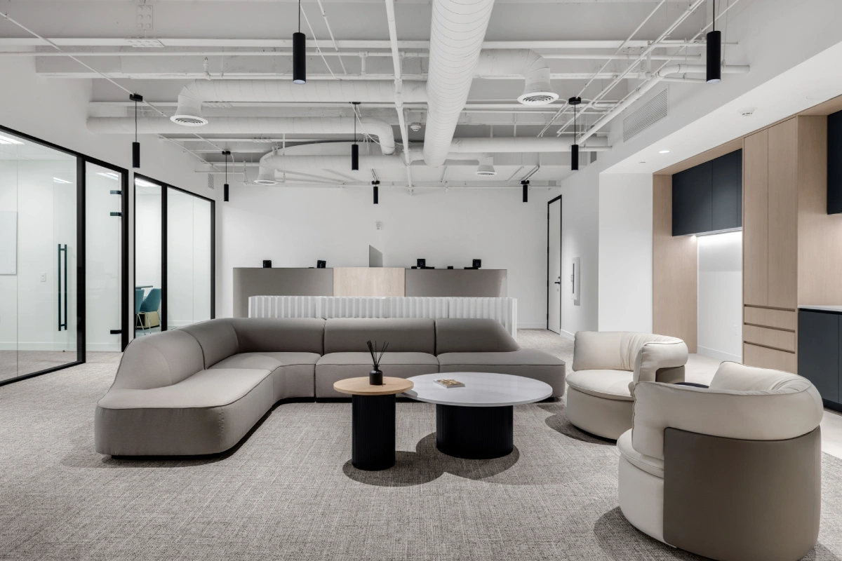
- Environmental base → neutral tones that support longevity
Designers who master brand color psychology understand that restraint creates sophistication.
Starter step: Create a 60/30/10 color distribution plan before finalizing finishes.
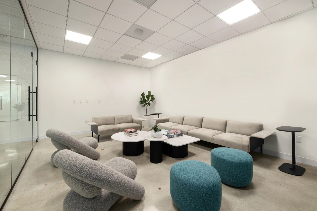
3. Translate, Don’t Replicate, the Brand Palette
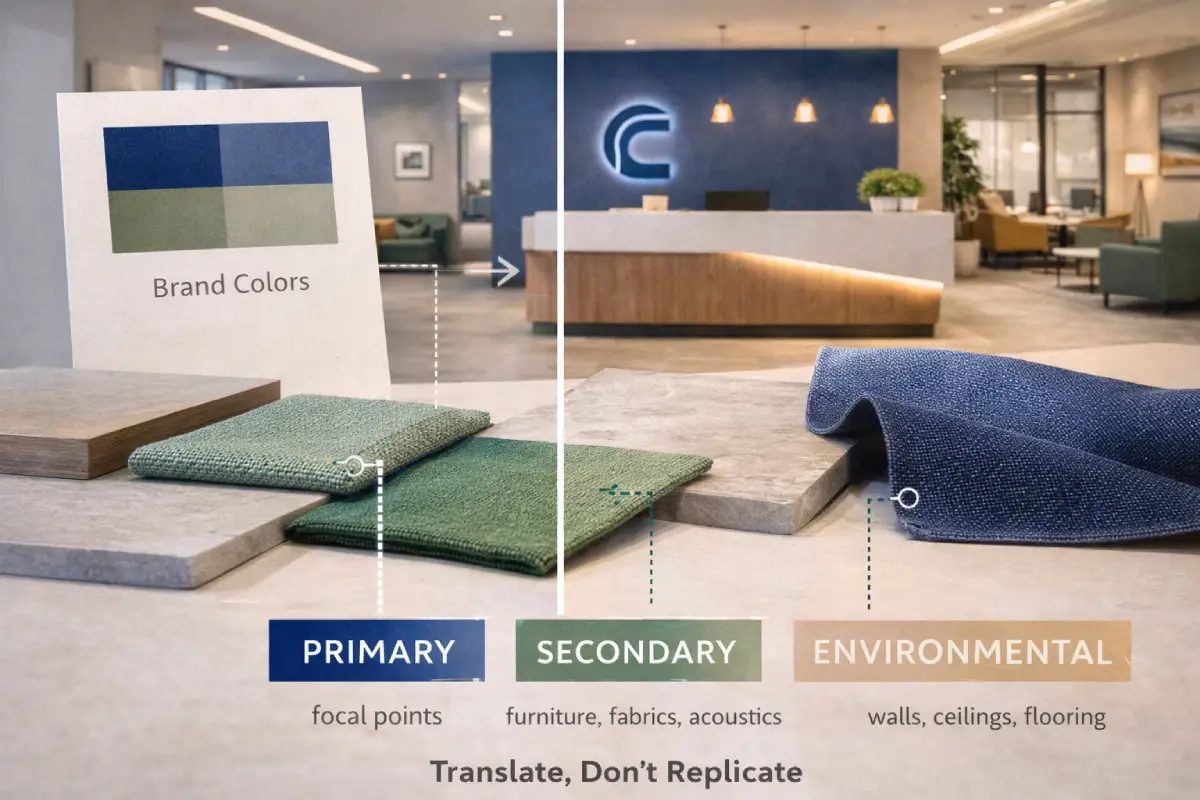
Your interior shouldn’t feel like a printed brochure.
Instead of directly applying hex codes, reinterpret brand hues through:
- Wood stains
- Textiles
- Stone veining
- Metal finishes
- Lighting temperature
Why it matters for Design projects: Literal replication dates quickly. Translation through materiality creates depth and longevity.
Starter step: Pull three materials that reflect each key brand color without using paint.
4. Balance Psychology With Performance
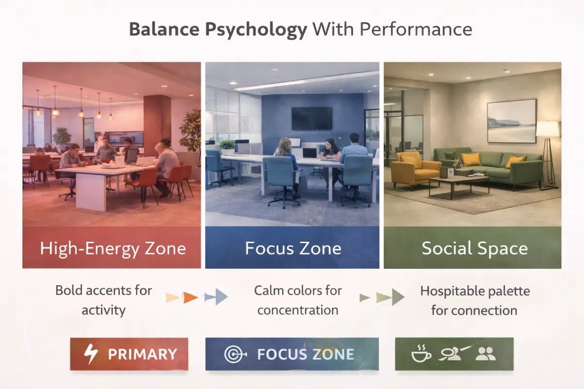
Colors affect mood and productivity. That’s well documented in environmental psychology.
Blues communicate stability but may feel cool. Reds energize but can overstimulate. Greens calm but can flatten contrast in low-light environments.
Why it matters: Design teams are increasingly accountable for performance metrics :retention, engagement, absenteeism.
Practical guideline:
- High-energy zones → more saturated accents
- Focus zones → muted tones and layered neutrals
- Social spaces → warmer, hospitality-inspired palettes
Starter step: Overlay your color strategy onto your zoning plan before construction documents are issued.
5. Use Brand Color for Wayfinding and Zoning
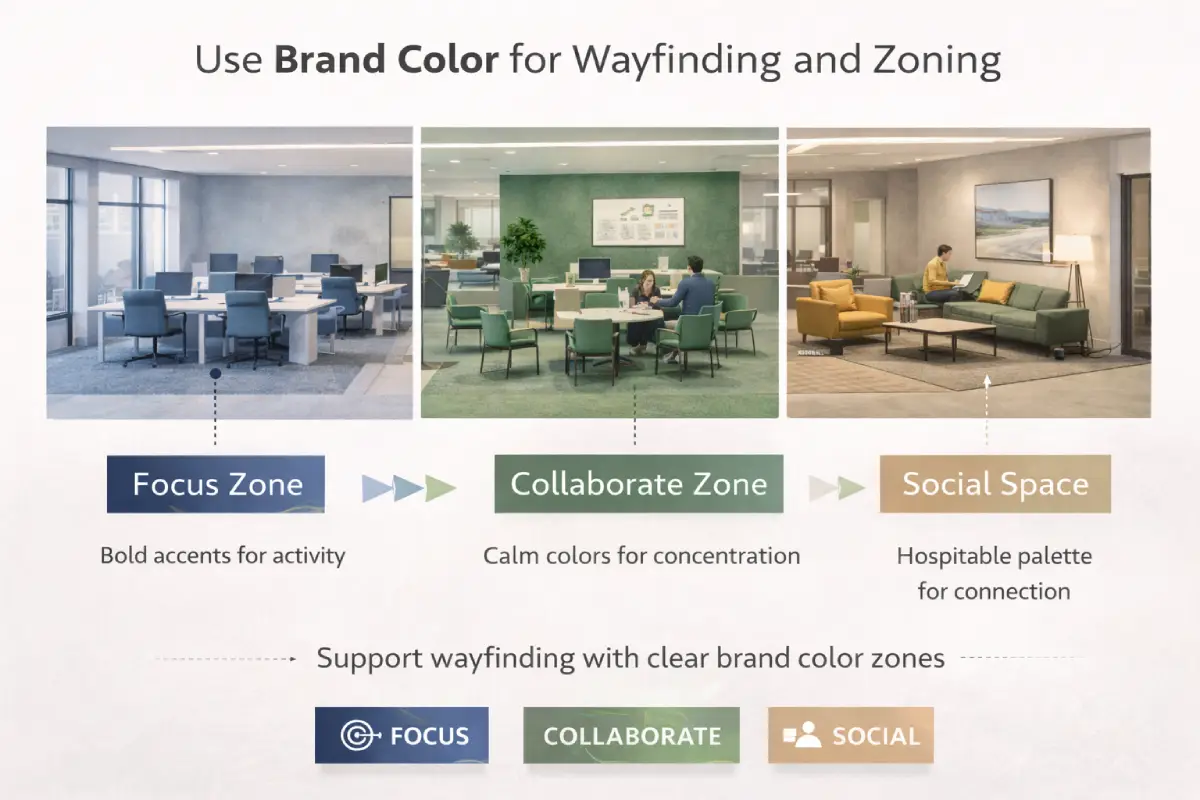
In hybrid environments, navigation clarity matters more than ever.
Instead of relying solely on signage, use tonal variations of brand colors to differentiate:
- Departments
- Collaboration neighborhoods
- Quiet zones
- Client-facing areas
Why it matters: Reduced confusion supports efficiency and improves first impressions for visitors.
Starter step: Assign one tonal family per floor or department, ensuring ADA contrast compliance.
6. Coordinate With Lighting Early
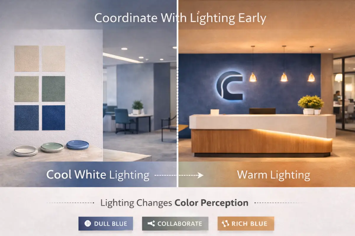
Color shifts dramatically under different light temperatures.
A cool white LED can make a warm brand hue appear dull. Warm lighting can oversoften vibrant tones.
Why it matters for project risk: Late-stage lighting adjustments can impact budget and schedule.
Starter step: Test full-scale paint samples under specified lighting conditions, not just showroom lights.
7. Consider Material Sustainability and Longevity
Brand color psychology should align with environmental strategy.
Highly saturated finishes may require more frequent repainting. Certain textiles fade faster in daylight-heavy offices.
Why it matters: Lifecycle cost and ESG reporting are increasingly intertwined with design decisions.
Starter step: Confirm UV stability, cleanability, and maintenance expectations before procurement.
8. Avoid Trend-Driven Overcommitment
Earthy moody tones, maximalist contrasts, and bold color blocking may dominate social media, but trends move faster than leases.
Why it matters for long-term design investments: Rebranding mid-lease can create significant retrofit costs.
Strategy:
- Art
- Soft seating
- Area rugs
- Graphics
Anchor in timeless neutrals. Layer trend-forward brand expressions in movable elements.
This preserves flexibility without sacrificing identity.
9. Measure Brand Experience After Occupancy
The success of brand color psychology isn’t subjective.
Post-occupancy evaluation should assess:
- Employee perception of brand alignment
- Visitor feedback
- Departmental engagement levels
- Leadership satisfaction
Why it matters: Design teams increasingly need ROI validation.
Starter step: Conduct 60–90 day surveys and compare feedback against pre-move benchmarks.
Common Mistakes in Brand Color Psychology
- Overusing primary logo colors
- Ignoring lighting calibration
- Skipping mockups
- Forgetting ADA contrast requirements
- Designing for trends instead of brand longevity
Avoiding these pitfalls protects both budget and brand equity.
Mini Recap
- Aligns physical space with identity
- Enhances productivity and comfort
- Supports navigation
- Protects long-term investment
- Strengthens cultural cohesion
When executed well, color becomes infrastructure, not decoration.
Ready to Translate Your Brand Into Space?
If you’re leading a design initiative and want your environment to reflect culture, performance, and long-term strategy, not just marketing collateral, we can help.
Our team partners with design leaders to audit brand palettes, evaluate lighting and material compatibility, and build layered color strategies that stand the test of time.

.webp)