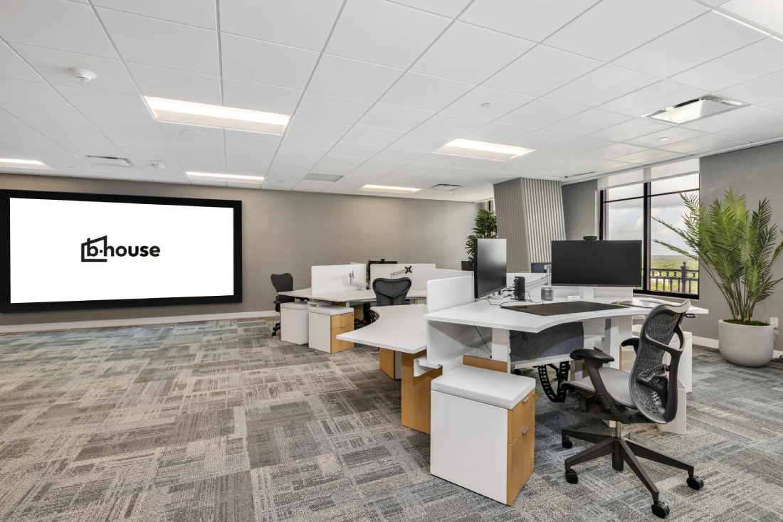
Earth Tones in Miami Commercial Interiors
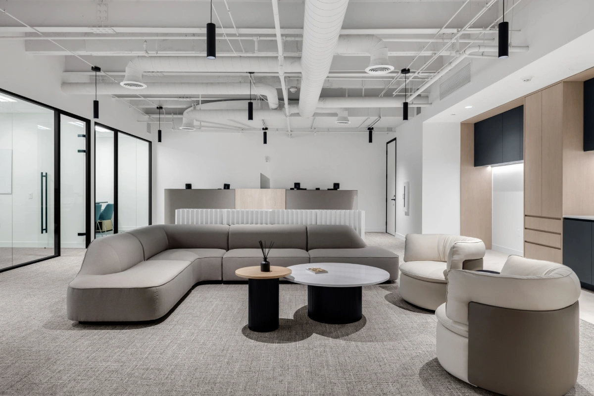
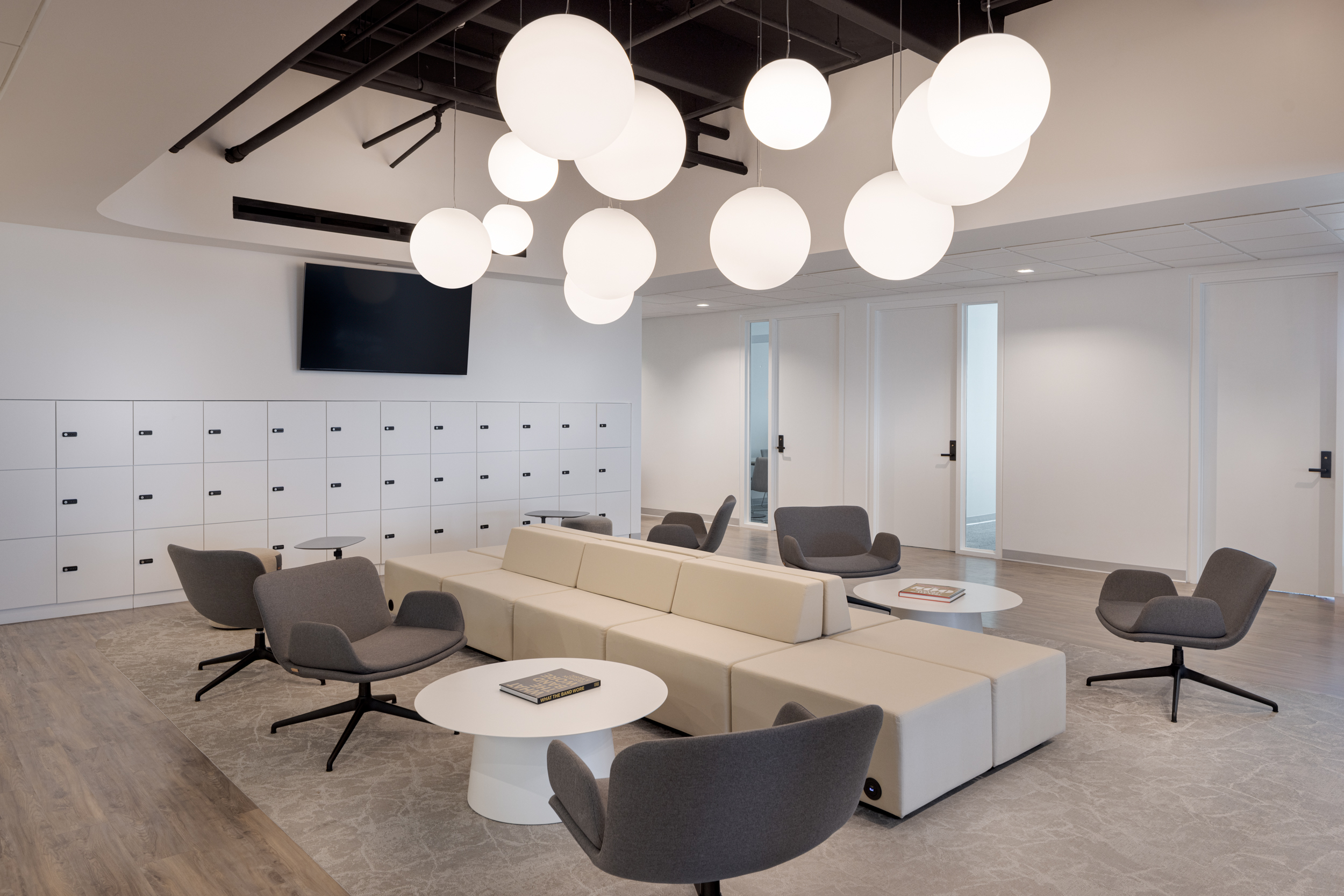
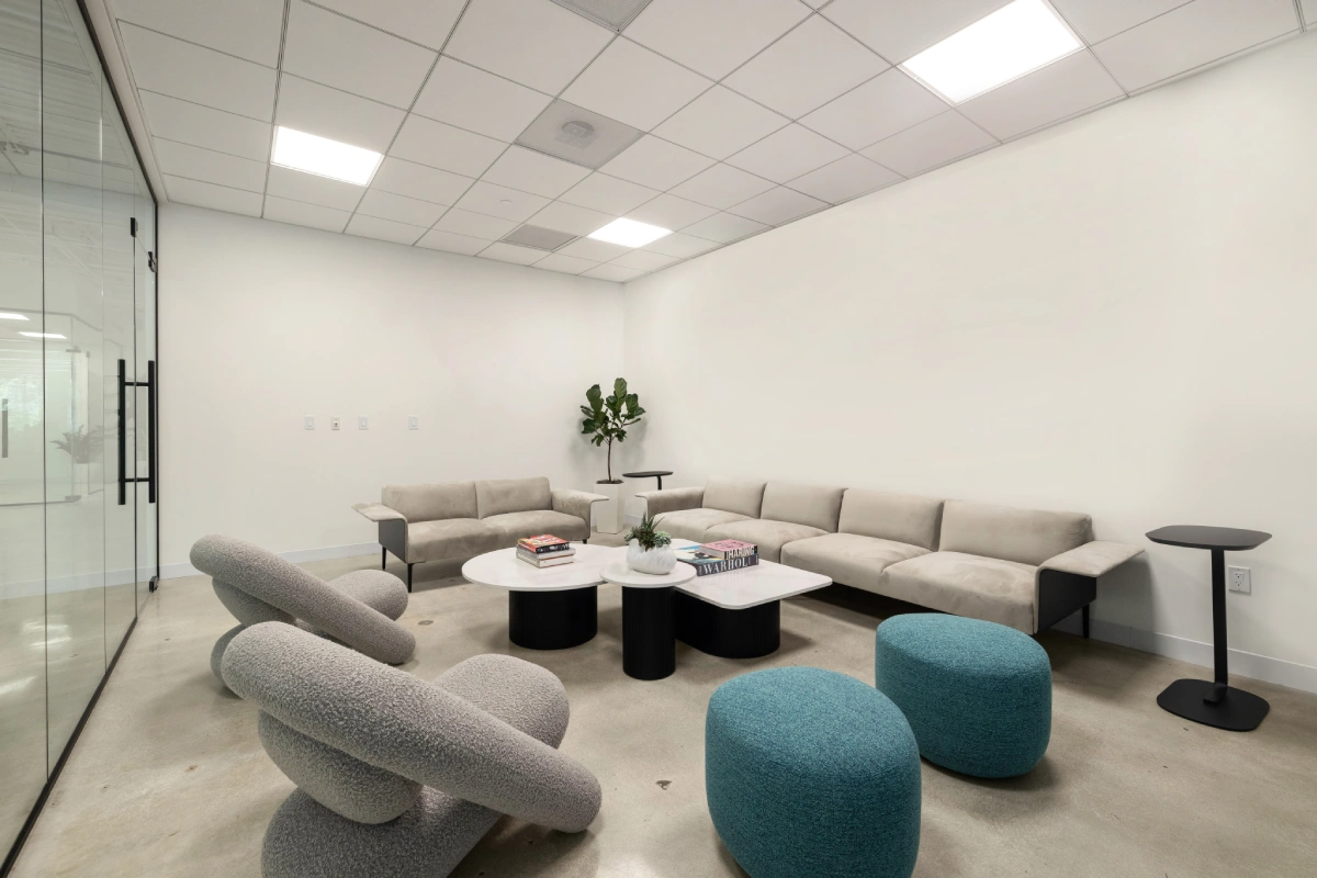
Luxury commercial interiors in Miami are shifting from sterile minimalism to a moodier, richer palette, think chocolate, olive, clay, and amber. These earthy hues, paired with natural textures and diffused light, are redefining what “luxury” feels like: sensorial, grounded, and emotionally resonant.
Executive Summary
- The new wave of luxury commercial interiors favors emotional warmth over visual sterility.
- Miami’s tropical climate inspires a palette of deep greens, terracotta, and raw linen neutrals.
- Textur, from matte plaster to woven jute, creates visual depth without clutter.
- Designers balance opulence with sustainability by using reclaimed materials and local sourcing.
- For commercial spaces, the goal is immersive luxury: spaces that connect brand identity to sensory comfort.
Trend 1: The Post-Minimalist Pivot Depth Over Sterility
What’s happening:
After a decade of glass, white walls, and chrome finishes, Miami’s design community is rejecting minimalism’s cold perfection. Today’s luxury commercial interiors add layers, pigment, patina, and material contrast, to signal authenticity and warmth.
Why now:
Corporate tenants are competing for talent who expect spaces that feel human. Designers are discovering that color psychology, warm neutrals, moss, clay, fosters calm focus and social cohesion.
Implications for designers:
Layer matte and tactile finishes: limewash paint, wool upholstery, brushed bronze. These communicate understated luxury without the visual fatigue of high-gloss surfaces. Learn how offices incorporate Art Deco elements
Trend 2: Moody Earth Tones Meet Tropical Light
What:
Moody doesn’t mean dark, it means dimensional. In Miami, “earthy” palettes adapt to natural light that’s abundant but sharp.
Why now:
Designers balance rich tones (burgundy, slate green) with open sightlines and rattan or linen to diffuse brightness.
Implications for commercial interiors:
Lighting design becomes critical. Use warm LEDs and dimming systems to prevent glare on darker surfaces. The result? Spaces that feel like retreats, not showrooms.
Trend 3: Texture as the New Ornamentation
What:
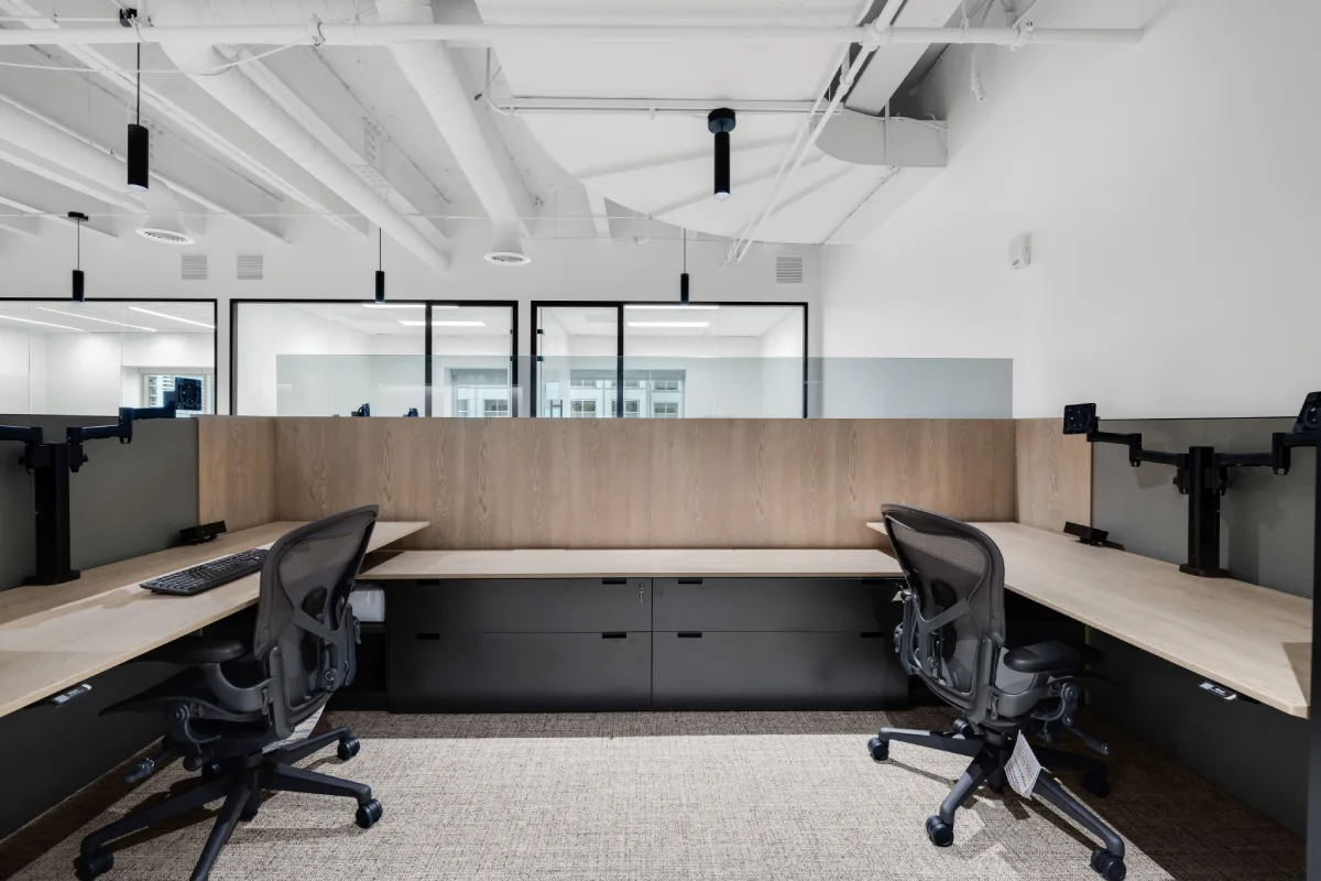
The new luxury relies less on artifice, more on tactility. Textured plaster, ribbed stone, and unpolished oak replace decorative excess.
Why now:
In a post-pandemic world, people crave tangible comfort. Textured materials invite touch and signal care, a subtle cue of hospitality.
Implications:
Architectural finishes double as branding. For a boutique law firm or developer’s HQ, the tactile palette becomes an extension of their values: credibility, permanence, and depth.
Trend 4: Sustainable Sourcing as a Status Symbol
What:
Sustainability has become the new indicator of prestige. Local wood species, low-VOC stains, and recycled metal details are now aesthetic choices as much as ethical ones.
Why now:
Corporate ESG goals meet client expectations for transparent design. Miami’s proximity to Latin American suppliers allows reduced freight and faster procurement.
Implications for specifiers:
Prioritize FSC-certified woods, regional stone, and artisanal textiles. Mentioning “locally sourced” in RFPs now carries design credibility and marketing weight.
Trend 5: Lighting Layers that Define Mood and Luxury
What:
Lighting defines tone, especially when balancing moody hues with daylight. Ambient, task, and accent lighting each play a role in shaping emotional resonance.
Why now:
Designers are leveraging tunable white LEDs to shift color temperature throughout the day, supporting wellness and energy cycles.
Implications:
Integrate lighting control systems early. For luxury commercial interiors, consider how dimming, reflection, and shadow contribute to spatial storytelling.
Trend 6: The Emotional ROI of Material Warmth
What:
Earth tones are not just visual trends, they carry psychological benefits. Warm neutrals signal safety, competence, and connection.
Why now:
Workplace design is being used to reduce stress and support retention. Texture, tone, and tactility are proving more effective than “wellness rooms” alone.
Implications:
Use natural palettes in high-traffic or client-facing zones, lobbies, lounges, and open collaboration areas, to promote trust and belonging.
How to Act on It Next Quarter
- Audit your current palette. Identify areas over-reliant on whites or grays; plan to reintroduce tonal contrast with mid-range hues.
- Source locally. Engage Miami-based millworkers and material suppliers to shorten lead times and enhance authenticity.
- Reimagine lighting. Add layered, controllable systems to highlight material texture rather than volume.
- Prototype sensorial vignettes. Create sample boards combining clay paint, linen, and warm metals to present to stakeholders.
- Tell the sustainability story. Document local sourcing and lifecycle impact in your design presentation, it doubles as a brand narrative.
Looking to transition your Miami workspace from cold minimalism to modern warmth?
B.House Design specializes in luxury commercial interiors that merge tactile richness, biophilic calm, and visual identity.
Let’s craft your next sensorial environment, where brand and wellbeing coexist beautifully.

.webp)